We’ve been busy, alright! It feels like the last five years have been a nonstop rollercoaster ride, with not a whole lot of ‘me time’ to self reflect. We love our clients, and so, we’ve been focusing on them.
But over this time, TouchFoundry has grown legs – and arms, some extra eyes, fingers, and some appendages you’re just not going to find in your high school biology textbook. In fact, the fantastic creature we’ve gradually transformed into had everything – except a new face. And so, after all these years of giving our hearts and souls to our incredible clients, we decided it was time to treat ourselves to a rebrand.
We’re not just talking a new shade of lip gloss here, ladies and gentlemen. No, no, no, we stripped down, looked ourselves in the mirror and asked ourselves, ‘Just who is TouchFoundry?’ We wanted to reassess not only our look, but our values and service offerings. It was also high-time we showcased all of the work we’ve been doing for the last five years – you gotta see it, it’s awesome.
We did a deepdive into TouchFoundry as a concept. We asked ourselves, what ideas represent us as a company? What defines our company culture? And also, who are our heroes in the industry, and what can we learn from them?
We came out of this spirit journey with a new understanding of what we wanted to do, and how we’d represent it – and what better way to show the world our brand spanking new image than to do what we do best? That’s right, we built a shiny new site with all the bells and whistles. But just how do you boil down five years of the good, the bad and the ugly? I’m glad you asked.
Well, what are we in the end? We’re not an agency, nor a design/dev sweat shop – we’re digital innovation consultants, and we needed our new brand to speak to that. We avoided the cold sleekness that agencies jump to, but rather embodied our values with a human-centric approach that represents us not as a faceless corporation, but as a hivemind of real people pouring our passion into our work.
We went with softer RGB colours (a little tip of the hat to our top of line web work) that reads as clean and mature, but still holds onto the playfulness that makes TouchFoundry the all work, all play company that it is. We let these tones guide the user experience by colour coding the various organs that make the TouchFoundry machine tick throughout the site.
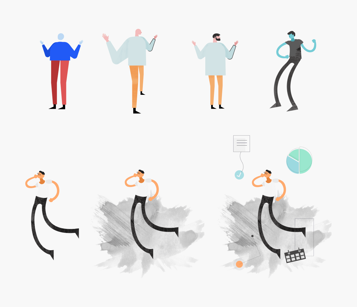
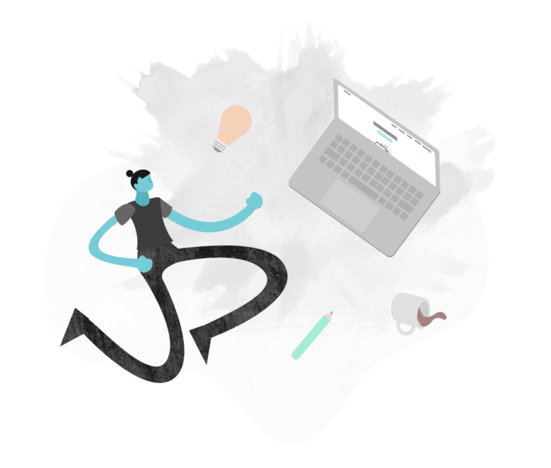
We tasked our talented design team to encapsulate this new vision of ourselves in custom, in house illustrations. We wanted more than mere space-filler pictures on our site – we wanted to embody our values and translate them to our audience, creating a site experience that immerses the viewer in everything that TouchFoundry stands for. These illustrations had to be amorphous and organic to represent our ability to shift, adapt and welcome new growth, as well as remind the viewer that we’re grounded in our humanity – that we’re individuals pouring our passion into our work, not a faceless agency.


We started with standard human forms and gradually iterated them into something uniquely TouchFoundry. We did away with literal colours and brought in our soft, yet mature pastel tones and married them to a papery texture that simultaneously melds naturally into the UI and jumps out of the page.
We couldn’t let a site go live without putting some extra love into our clients page, after all, they’re what got us to where we are today. We needed a way to direct specific users to past and present projects and clients that are relevant to them – what’s the point in a name drop if you have no idea who we’re talking about? And what’s the best way to display over 30 (and counting) projects on one page without inundating potential-customers? Filter. Now there’s nothing new about search filters, but they so often make content navigation feel mundane and transactional. Keeping our user-centric values in mind, we ensured every component on the website is an experience that matters. We scaled that ethos into an easy to navigate, keyboard friendly means to find the projects relevant to specific user’s interests or industry. We wanted to make sure our work, our proudest moments, were put on a pedestal, and referring to them in a narrative context instead of checkbox filters provides that rich experience that is the TouchFoundry standard of excellence.
Context filters let you zero-in on specific past projects that are meaningful to you, so that if you’re a potential client looking to see if we’re the right fit for you, you can explore our work across industries, regions and verticals.
There’s something beautiful happening at the backend as well, after all, we embody a balance of jaw-dropping design and industry leading development. We wanted to ensure that we showcased the best performance we could provide – and that starts at home. We focused on making sure our site loaded extremely fast on both desktop and mobile devices. Using lazy loading mechanisms, content is loaded on demand as users browse, meaning our website remains bandwidth friendly and doubles up with a great user experience where one can see content unfolding before their eyes.
But it’s about more than just user-experience – by developing the site with these smooth loading speeds, we score high on Google Page Speed insights. A high performing site means a high ranking site, just another way our we provide holistic products that tick all the necessary boxes. Trading optimization for experience is always a touch balance, and it’s safe to say we landed in the goldilocks zone.
Let’s not forget, it wouldn’t be a TouchFoundry site without a little twist of delight in every interaction. Restrained but graceful animations give life to the user experience, making the site feel like a living, breathing entity, whilst keeping usability at the forefront.
But what really brought our rebrand together – what made it the truly transformative experience that we were looking for, was finally having the opportunity for the entire team to put something of themselves into a single project. It was a truly collaborative effort, and we had a whole of fun working on it, and we think it shows.
